
The 7 Best White Paint Colors for 2026: Why "Warm & Organic" is Taking Over
Design by: Emily Henderson Design; Photo by: Zeke Ruelas
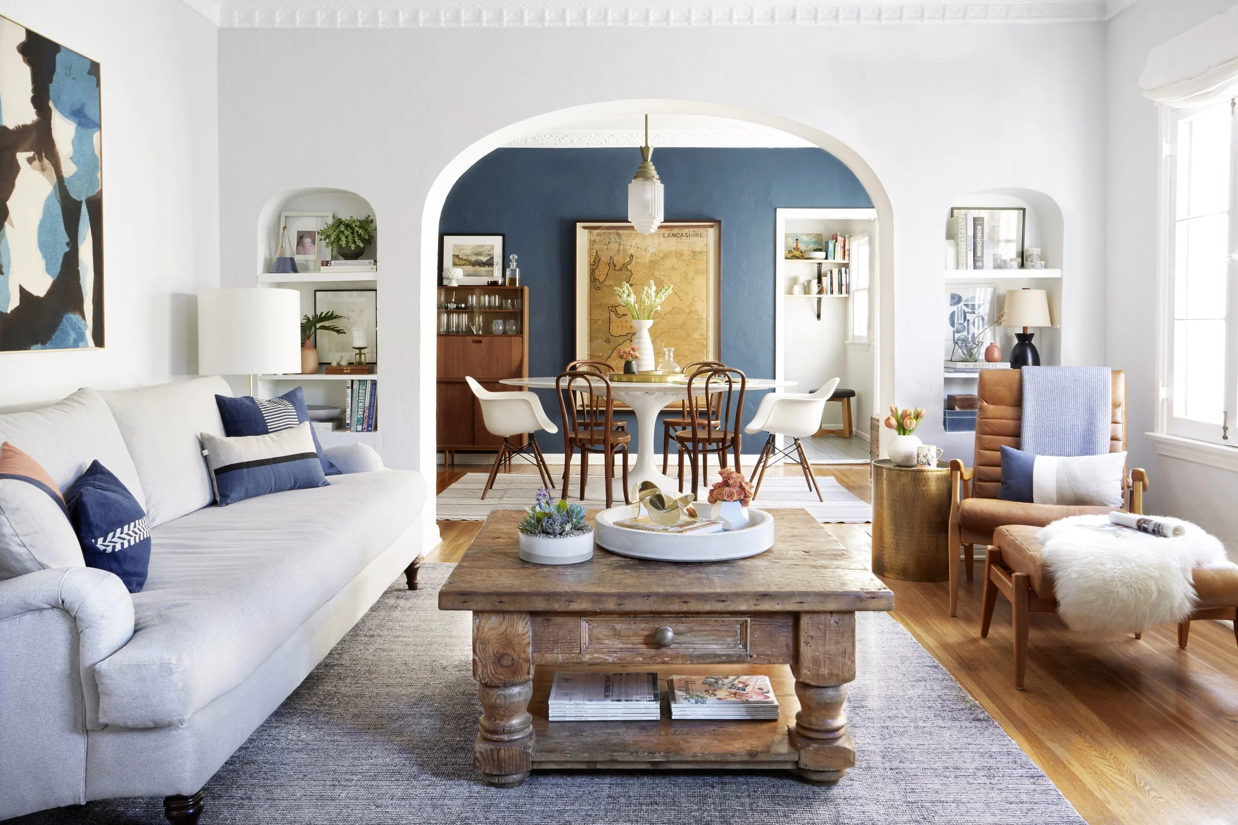
For many years, neutral shades — and white paint in particular — were the epitome of on-trend design. This palette created a calm yet versatile backdrop for all-in-one spaces, where loved ones could gather to eat, dine, and hang out. But is white paint trending for 2026? The answer is still yes, but with a caveat: Rooms with a bolder personality are more desirable these days, like all-over blue paint, so if you’re planning on using white paint, it’s best to make it feel very intentional. The trick is to choose shades that feel warm and organic, which lend themselves well to more colors, textures, and patterns throughout.
If you’re thinking of updating your space with a fresh coat of white paint in 2026, read on for guidelines to ensure that your pick meets the “warm and organic” trend that’s currently taking over, plus my seven recommendations for the best white paint colors that’ll look great now and stand the test of time later.
How to Shop for White Paint
One of the reasons why white paint is perennially desirable is because it can complement any architectural style and color scheme. But just because white paint as a whole is flexible doesn’t mean that any shade will do for your specific needs. Picking the best shade for your project comes down to the details, and you’ll want to keep a few rules in mind as you shop for swatches.
Find the right undertone: You can spot the differences in white paints more easily if you pay attention to their undertones, which you can think of as a base layer that becomes more apparent in different light. “Warm whites” have orange, yellow, or red undertones that can create a cozy, lived-in atmosphere. “Cool whites” have gray, blue, or green undertones that tend to feel more modern. “Neutral whites” don’t have a noticeable undertone, which can translate into a variety of designs — or can make them fall flat. Either way, a white paint’s undertone is the foundation for its overall effect.
Notice natural light: How white paint looks in a space will also come down to how much sunlight it receives. If you’re planning to swatch a few shades on your walls to see how they look (and you should), the orientation of the room toward the sun will make the color look different throughout the day.
North-facing rooms tend to get cool, soft light, so “cool whites” will likely make these spaces feel sterile. South-facing rooms get warm rays, so cool tones could be a worthwhile contrast. East-facing rooms get a lot of sun in the morning while west-facing rooms receive it in the afternoons, making warmer undertones more ideal. Paint large enough swatches on your walls to notice how the light changes their appearance from morning to night — it can be a fun experiment!
See how surroundings fit: Much like how a picture’s frame influences the appearance of the art inside, a white paint’s success also depends on surrounding features. You’ll want to account for the color of the floors in the room, and whether that shade complements or contrasts with the undertones in your paint. It’s a good idea to account for lighting and landscaping as well, plus whether these factors will make the color appear warmer or cooler. White paint can be flexible, but it’s also very fickle.
Pick the best finish: While a matte or flat finish is most common for walls, since it hides imperfections best, you should think about alternatives for details like baseboards or built-ins. An eggshell finish is easier to clean than matte or flat, and comes with a slight sheen. A satin or semi-gloss finish has a high durability that’s easiest to keep clean, but imperfections are easy to spot, like fingerprints. A solid option to consider? Sherwin-Williams Emerald Urethane Trim Enamel in "High Reflective” White will give you professional results with the right prep (more on that below).
Remember, too, that you can reduce a paint color’s intensity by asking for a lower percentage of the shade — so, asking for 50% of a particular color makes it lighter, but asking for 75% will make it darker. This is one way to provide some variation across surfaces, such as if you were to also paint the ceiling, or create a custom look. Lastly, pay attention to LRV, or light reflectance value: higher means brighter, lower means warmer.
How to Apply White Paint for Professional Results
Painting a room is often touted as the easiest way to transform it. That’s probably true, but only if you decide to go straight to rolling a fresh coat on the walls. The truth is, painting is straightforward and won’t be as much of a time commitment as, say, building your own furniture. But to do it right — which means, to make sure that it looks professional — you’ll want to do the prep work. Here’s what that entails:
Supplies: Paint trays, angled brushes, and microfiber rollers are a must. But you’ll also want premium painter’s tape, like FrogTape Advanced, for the crispest lines (it’s the exclusive tape for Spring 2026 One Room Challenge for a reason). Depend on drop cloths to protect your floors, goggles to guard your eyes, and stir sticks to make sure your paint is ready for a smooth application.
Clear the room: You’ll want to remove as much furniture as possible from the space, and take down any light fixtures that might get in the way (including art, but doesn’t that seem obvious?). If a furnishing is too heavy, push it with all your might away from the walls so that you can paint around it, then cover it in plastic.
Clean and smooth the walls: When was the last time you washed your walls? If the answer is “never,” then all that dirt and dust will get into your fresh white paint, making it less pristine. Scrub your walls and baseboards with soap and water, and then cover any cracks or holes with caulk and spackle. When that dries, sand it down for a smooth finish and make sure no dust remains. Yes, this part can be a slog. But the results are worth it.
Apply painter’s tape: As your rollers, paint brushes, and paint cans await their time to shine, spend a few minutes applying painter’s tape where needed: along baseboards, across crown molding, and around windows, for instance. Then, apply a primer — which is a particular must-do if you’re going from a dark paint to white. After, it’s time for your fresh coats of white paint.
The Best White Paints for 2026 and Beyond
White paint will never go out of style, even as trends change. If you’re looking for a white paint that can withstand the ups and downs of trends — and currently meet the “warm and organic” style” of the moment — read on for my seven recommendations.
Behr’s Blank Canvas:Behr’s Blank Canvas is a soft white with warm undertones, so while it works in every space, it’s probably best in living rooms, bathrooms, and bedrooms. I wrote about this paint when it was announced as the Color of the Year 2023 for Dwell, and it comes across as a cozier shade in the spectrum of whites. This is a solid choice for warm-wood furnishings or details that have bright personalities: Patterned upholstery, large gallery walls, and eye-catching lighting would all feel balanced against this color.
Backdrop’s Cool Moon: For those who are looking for a cool-toned white paint, my vote goes to Backdrop’s Cool Moon, which has that crisp finish this undertone epitomizes without coming across as too chilly. This is a bright white to choose for a living room if your surrounding colors will lean more natural: greens, blues, beiges, and browns will all result in a balanced finish.
Behr’s Swiss Coffee: There’s a reason why Behr’s Swiss Coffee is likely on every “best white paint” list, including this roundup I wrote for Domino back in 2018. It’s a warm white with beige undertones, so it can read as a color even though it’s still very much a neutral. This is the one to pick if you’re still very much a minimalist — Swiss Coffee is calm in a can — but can also help your style transition into more maximalist territories. Given its warmth, it can handle a kaleidoscope of surrounding colors, patterns, and textures.
Benjamin Moore’s White Dove: When friends ask me for a white paint designers most recommend, it’s likely Benjamin Moore’s White Dove. This off-white has yellow-gray undertones that make it feel inviting, so you can use it everywhere from a kitchen and hallway to a living room and bedroom for a cozy feel. I like it best in spaces that get a lot of natural light, but it can also be used to brighten rooms that are otherwise in the shade.
Clare’s Snow Day: When you’re searching for a cool-toned white, Clare’s Snow Day provides a bright and clean finish that’s best for modern aesthetics. Consider this option when you want a pure white that won’t seem like a hospital room if you switch on a lamp, and if you’re apt to choose white oak finishes over darker tones. This can also be the right white to choose if you want to go bolder with surrounding finishes like bright floor tiles and colorful trim.
Pantone’s Cloud Dancer: As the Color of the Year for 2026, Pantone’s Cloud Dancer features gray undertones that make it highly agreeable in any room without sacrificing a calm-meets-cozy atmosphere. I’d specifically style Cloud Dancer in a bedroom, with an upholstered bed that matches the shade and layered linens that add depth like deep purple and navy. A Noguchi-inspired light fixture overhead seems like a no-brainer, too.
Sherwin-Williams’s Alabaster: If Behr’s Swiss Coffee seems too creamy and Clare’s Snow Day is too crisp, then Sherwin-Williams’s Alabaster should act as a middle ground. This shade has just enough depth to balance out darker details like warm leather and rich woods, but is still peaceful enough to feel calm and airy if you’d rather lean into that realm. Alabaster can go either way.
Related: This Is Exactly How I Keep My 800-Square-Foot Home Organized Using IKEA (Starting at $12); The Best Exterior Paint Colors for Every Architectural Style, According to a Color Consultant